If you have been into a carpet showroom in the last year or two, you may have noticed that the colours on display are remarkably like the various shades of coffee available at your favourite café. Many carpet samples even have colour names like Cappuccino, Latte or Expresso.
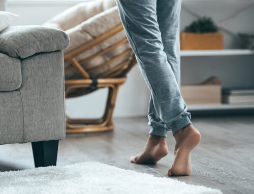
A wall of carpet samples can be confusingly similar with most samples being a combination of grey/beige/brown. These taupe shades range from pale mushroom right through to charcoal. The depth of colour will vary, with the key to good decorating identifying the dominant shade in the taupe and matching to your other household furnishings.
Some taupes will be somewhat pink based, whilst others may even be grey with a green tinge. You may well find that your preferred colour scheme will only work with one of the many taupe tone options.
A good example is the Feltex Lasting Touch solution dyed nylon twist pile carpet, this is a residential extra heavy duty carpet with a great range of taupe tones. View the following link to see colour range:
Photos of carpet are only a first guide, you need to see samples in the flesh and preferably in the home to be sure which one works for you.
Once you find the which tone of carpet you prefer, you can go a lighter or darker shade and still keep the integrity of your colour scheme.
Whilst not an Interior Designer, as a Carpet Expert I have worked alongside many over the last 35 years and find that experience is helpful for our customers in their colour selections
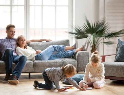
We install carpet and timber flooring regularly in Builders Display Homes. They are a good place to get ideas on decorating with current colours and trends. Considerable time and effort is put into creating an inviting environment.
Most display homes are using currently taupe tone carpets and adding vibrant colour accessories like window coverings, cushions, pictures and lamp shades to make the whole thing pop.
By Greg Willis